
Responsive and Mobile Friendly Website Design Service in Lucknow Design Service in Lucknow
Professional Responsive & Mobile Friendly Website Design Services in LucknowWebsites That Look Perfect & Work Flawlessly on Every Device — Every Time.
Looking for expert responsive and mobile friendly website design services in Lucknow? I'm Varsha, a professional web designer and web developer in Lucknow with 3+ years of experience designing and developing fully responsive, mobile-optimized websites for businesses, professionals, and organizations across industries.
Today, more than 70% of all internet traffic comes from mobile devices. Your potential customers are searching for your business, browsing your services, and making purchasing decisions on their smartphones every single day. If your website doesn't look great and function flawlessly on mobile phones and tablets, you're likely losing a significant number of potential customers before they even learn about your services.
As a specialist in responsive web design in Lucknow, I create websites that automatically adapt to provide a seamless, fast, and visually appealing experience across every screen size—from smartphones and tablets to laptops and desktop computers. Every website is designed to ensure visitors enjoy smooth navigation, quick loading times, and an excellent user experience, regardless of the device they use.
With one responsive website, your business delivers a consistent, professional, and high-performing experience on every device—helping you engage more visitors, build trust, and convert them into customers.
What Is Responsive Web Design?
Responsive web design is an approach to website design and development where the website's layout, content, images, and functionality automatically adjust and adapt to fit the screen size and device type of the visitor — delivering an optimized viewing and interaction experience whether the visitor is on a desktop computer, a laptop, a tablet, or a smartphone.
A responsive website does not have a separate mobile version — it is one single website that intelligently rearranges and rescales itself to look and function perfectly on any device. This is achieved through flexible grid layouts, fluid images, and CSS media queries that detect the visitor's screen size and apply the appropriate layout and styling rules automatically.
Here's what responsive design means in practical terms for your website visitors:
On a Desktop
Full-width layouts, multi-column designs, larger images, and full navigation menus deliver a rich, detailed browsing experience.
On a Tablet
Layouts adjust to a medium screen size, navigation simplifies, and touch-friendly elements ensure smooth interaction on tablet screens.
On a Smartphone
Content stacks into single columns, navigation collapses into a mobile menu, buttons become larger and easier to tap, images resize proportionally, and the entire experience is optimized for one-handed mobile browsing.
The result is a website that feels native and natural on every device — never broken, never awkward, never requiring the visitor to zoom in or scroll sideways to read your content.
As a responsive website designer in Lucknow, I build every website with this mobile-first, device-agnostic approach from the very beginning — not as an afterthought.
Why Responsive & Mobile Friendly Website Design Matters for Your Business
The numbers are impossible to ignore. Mobile internet usage in India has exploded in recent years — driven by affordable smartphones and widespread 4G and 5G connectivity — and businesses in Lucknow are feeling the impact directly. Here's why responsive web design is absolutely critical for your business:
Google Prioritizes You
Google's mobile-first indexing means non-responsive sites rank lower, costing you valuable organic traffic and local visibility.
Stop Losing Visitors
Mobile users abandon frustrating, non-responsive layouts within seconds. Keep your bounce rates low and engagement high.
Boost Conversions
Tappable buttons, readable text, and effortless navigation ensure casual mobile browsers easily convert into paying customers.
The Lucknow Edge
Many local competitors still rely on outdated layouts. Stand out instantly with a beautifully optimized, fast-loading mobile experience.
Social Media Ready
Clicks from Instagram, Facebook, or WhatsApp links come from phones. Make sure their landing experience is seamless, not broken.
Cost-Effective & Future-Proof
Maintain just one website that scales flawlessly to fit any screen size or new device introduced down the road.
Responsive & Mobile Friendly Website Design Services I Offer
1. Custom Responsive Website Design & Development
I design and develop fully custom, responsive websites from scratch — tailored specifically to your brand, your business goals, and your target audience. Every layout, every section, every element is designed with a mobile-first philosophy — ensuring your website delivers a perfect experience on every device, from the very first line of code to the final launch.
2. Mobile-First Website Design
Mobile-first design means designing your website for the smallest screen first — and then progressively enhancing the experience for larger screens like tablets and desktops. This approach ensures your most common user — the mobile visitor — always gets the best possible experience, while desktop visitors benefit from a richer, more expansive layout. I apply mobile-first design principles to every website I build.
3. Responsive WordPress Website Design
WordPress powers over 43% of all websites globally — and a properly built responsive WordPress website delivers an outstanding experience on every device. I design and develop fully responsive WordPress websites — with custom themes, optimized layouts, and mobile-friendly features — ensuring your WordPress site performs flawlessly across all screen sizes and devices.
4. Responsive E-Commerce Website Design
Mobile commerce is the fastest growing segment of online retail in India. If your online store isn't perfectly optimized for mobile shopping, you're losing sales every single day. I design fully responsive e-commerce websites — with mobile-optimized product pages, touch-friendly navigation, streamlined mobile checkout, and fast loading product images — delivering a seamless mobile shopping experience that converts smartphone browsers into buyers.
5. Responsive Business Website Design
For businesses of all sizes in Lucknow — from small local services to growing corporate organizations — I design fully responsive business websites that look professional, load quickly, and work flawlessly across every device your potential customers use to search for and evaluate your business.
6. Responsive Landing Page Design
Landing pages receive large volumes of mobile traffic — especially from social media ads and Google Ads campaigns. I design fully responsive, mobile-optimized landing pages that deliver a fast, focused, and conversion-optimized experience on smartphones — ensuring your paid and organic traffic converts effectively regardless of the device your visitors are using.
7. Non-Responsive Website to Responsive Conversion
Do you have an existing website that is not mobile-friendly? I offer professional responsive website conversion services — rebuilding and restructuring your existing website to be fully responsive — without losing your existing content, brand identity, or search engine rankings. This is a cost-effective way to bring an outdated non-responsive website up to modern mobile standards.
8. Responsive Website Redesign
If your current website looks or functions poorly on mobile devices, I offer a complete responsive website redesign — rebuilding the design and development foundation of your website with a fully responsive, mobile-first approach that dramatically improves the mobile user experience, reduces your bounce rate, and improves your Google rankings.
9. Mobile Performance & Speed Optimization
A responsive layout alone isn't enough — your website also needs to load fast on mobile networks. I offer mobile performance optimization services — including image compression and optimization, lazy loading implementation, browser caching configuration, code minification, and mobile-specific performance improvements — ensuring your website loads quickly even on slower mobile connections.
10. Cross-Device & Cross-Browser Testing
Every responsive website I build is rigorously tested across a wide range of real devices — including popular Android and iOS smartphones, tablets, laptops, and desktop monitors — and across all major browsers including Chrome, Safari, Firefox, and Edge — to ensure consistent, flawless performance and appearance everywhere your visitors encounter your website.
What Makes a Truly Mobile Friendly Website?
Not every website that claims to be mobile-friendly actually delivers a great mobile experience. Here are the key elements that define a genuinely high-quality responsive and mobile friendly website:
Fluid & Flexible Layouts
A truly responsive website uses fluid grid layouts that stretch and compress proportionally — rather than fixed pixel widths that break on smaller screens. This ensures every element on every page adjusts gracefully to fit any screen size without breaking or overflowing.
Mobile-Optimized Navigation
Desktop navigation menus with multiple levels and many items need to transform into clean, accessible mobile navigation — typically a hamburger menu or slide-out drawer — that is easy to open, easy to browse, and comfortable to use with a thumb on a smartphone screen.
Touch-Friendly Interface Elements
Buttons, links, form fields, and interactive elements need to be large enough to tap accurately with a finger — without accidentally hitting adjacent elements. I design touch-friendly interfaces with appropriately sized tap targets and comfortable spacing throughout.
Readable Typography on Small Screens
Text that is perfectly readable on a desktop can become tiny and squint-inducing on a smartphone. I carefully manage font sizes, line heights, and text contrast across all screen sizes — ensuring your content is always easy to read on every device.
Optimized Images for Every Screen
Large, high-resolution images that look stunning on a desktop can dramatically slow down a mobile website if not properly handled. I implement responsive image techniques — including appropriately sized images for different screen sizes, modern image formats, and lazy loading — ensuring your images look great and load fast on every device.
Fast Mobile Loading Speed
Mobile users are impatient — and mobile networks can be slower than desktop connections. I optimize every responsive website for fast mobile loading — targeting load times under 3 seconds on average mobile connections — keeping visitors engaged and reducing bounce rates.
Mobile-Friendly Forms
Contact forms, inquiry forms, booking forms, and checkout forms need to be easy to complete on a small touchscreen. I design mobile-optimized forms with large input fields, appropriate keyboard types for each field, minimal required inputs, and streamlined layouts that make form completion on mobile quick and frustration-free.
Properly Scaled & Positioned CTAs
Call-to-action buttons are the most critical conversion elements on any page — and they need to be highly visible and easy to tap on mobile devices. I ensure every CTA is prominently positioned, appropriately sized, and visually distinct on every screen size.
No Horizontal Scrolling
A mobile-friendly website never requires the visitor to scroll sideways to see content. All content fits within the viewport width at every screen size — creating a clean, natural vertical scrolling experience throughout.
Click-to-Call & WhatsApp Integration
For mobile visitors who want to contact your business directly, I integrate click-to-call phone links and WhatsApp chat buttons that allow smartphone users to call or message your business instantly with a single tap — maximizing mobile lead generation.
Key Features of Every Responsive Website I Build
My Responsive Website Design Process
Discovery & Device Strategy
We begin with a detailed consultation to understand your business, your target audience, and the devices your customers most commonly use to access your website. Understanding your audience's device behavior shapes every design and development decision that follows.
Competitor & Benchmark Research
I research your competitors' websites and analyze how well they perform on mobile devices — identifying opportunities to deliver a significantly better mobile experience that gives your website a competitive advantage in Lucknow's market.
Mobile-First Site Architecture
I plan your website's complete structure with a mobile-first mindset — designing the navigation, content hierarchy, page layouts, and user flow for the smallest screen first, then progressively enhancing for larger screens.
Custom Responsive Design
I create a fully custom visual design for your website — designing every page at multiple screen sizes simultaneously to ensure the layout, typography, imagery, and all interface elements work beautifully across every breakpoint from mobile to desktop.
Responsive Development
I build your website with clean, modern, and fully responsive HTML, CSS, and JavaScript — implementing fluid grids, flexible images, CSS media queries, and all the technical foundations of a truly responsive website with precision and care.
Mobile Performance Optimization
Images are optimized, code is minified, caching is configured, and all mobile-specific performance improvements are implemented — targeting fast loading times across both mobile and desktop connections.
Content Integration
All your content — text, images, videos, and other media — is integrated into the responsive layout in a structured, mobile-optimized, and SEO-friendly manner across all pages.
Cross-Device & Cross-Browser Testing
Your website is rigorously tested across a comprehensive range of real devices and browsers — including popular Android smartphones, iPhones, iPads, laptops, and desktop monitors, across Chrome, Safari, Firefox, and Edge — verifying consistent, flawless performance everywhere.
Google Mobile-Friendly Verification
I run your website through Google's Mobile-Friendly Test and Core Web Vitals assessment — verifying that your website meets Google's mobile usability standards and addressing any issues identified before launch.
Launch
Your responsive website goes live. I manage all technical deployment aspects — DNS configuration, SSL verification, final cross-device checks, and performance monitoring — ensuring a smooth, error-free launch.
Training & Handover
I provide a walkthrough of your website's content management system, ensuring you can confidently manage and update your website's content across all devices after launch.
Post-Launch Support
After launch, I remain available for ongoing support, performance monitoring, content updates, and further optimization — ensuring your responsive website continues to deliver an outstanding experience on every device.
Industries I Serve with Responsive Website Design in Lucknow
I design and develop fully responsive, mobile-friendly websites for businesses across all industries, including:
Healthcare & Doctors
Mobile-friendly clinic and doctor websites that make appointment booking easy on smartphones.
Real Estate & Property
Responsive property listing websites with mobile-optimized search and inquiry features.
Travel & Tourism
Mobile-friendly tour and travel websites with easy package browsing and booking on smartphones.
Hospitality & Hotels
Responsive hotel websites with mobile-optimized room browsing and reservation functionality.
Weddings & Events
Mobile-friendly wedding planner and event management websites with stunning visual galleries.
Cafés & Restaurants
Responsive food business websites with mobile-optimized menus and reservation features.
Construction Companies
Mobile-friendly contractor and builder websites with impressive project portfolios.
IT Firms & Startups
Responsive technology company websites that perform perfectly on every device.
Education & Coaching
Mobile-friendly institute and coaching center websites for student inquiries and enrollment.
E-Commerce & Retail
Fully responsive online stores with mobile-optimized shopping and checkout experiences.
Professional Services
Mobile-friendly websites for lawyers, accountants, consultants, and other professionals.
Local Service Businesses
Responsive websites for all types of local service providers across Lucknow.
Responsive Website Design in Lucknow
Strong Technical Foundation
B.Tech in Computer Science EngineeringIndustry-Trained Professional with hands-on experience at DigiCoders Technologies, Lucknow.
3+ Years Experience
Hands-on responsive web design & development. Real expertise, real results.
Mobile-First Approach
Not an afterthought—mobile optimization is built in from day one.
100% Custom Layouts
Unique, brand-specific responsive designs—never generic templates.
Cross-Device Testing
Rigorous testing executed on real smartphones, tablets, and desktop devices.
Google Mobile Verified
Every single website meets Google's official mobile usability standards.
Core Web Vitals
Optimized to be fast, stable, and visually complete on every modern screen.
Fast Mobile Loading
Advanced mobile performance optimization included in every project package.
SEO-Friendly Structure
Built structurally to rank exceptionally well in Google's mobile-first index.
Affordable Lucknow Pricing
Premium responsive design packages configured at competitive local rates.
Timely Project Delivery
Clear project timelines matched with regular progress updates and no delays.
Post-Launch Support
Available for long-term technical ongoing updates and maintenance improvements.
Personal Communication
Direct workflow. You work directly with me personally throughout the entire project lifecycle.
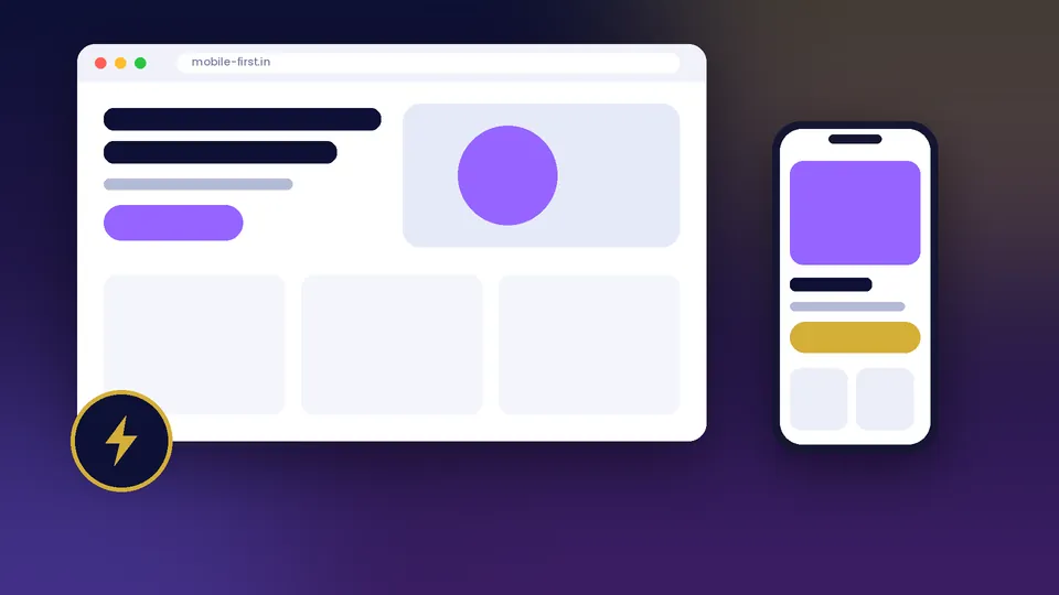 Fast Loading
Mobile Friendly
SEO Ready
Responsive & Mobile Friendly jo aapke business ko grow kare
Har screen par perfect dikhne wali mobile-first websites. Har project me design, speed aur conversions teeno par focus hota hai.
- Aapke brand ke hisaab se unique design
- Mobile, tablet aur desktop par perfect layout
- Clean code, fast loading aur SEO-friendly structure
- Launch ke baad bhi support
Recent Projects
FAQs — Responsive & Mobile Friendly Website Design in Lucknow
Ready for a Website That Looks & Works Perfectly on Every Device?
Don't let a non-responsive website cost you customers, leads, and Google rankings. Let's build a fully responsive, mobile-first website that delivers an outstanding experience to every visitor — on every screen, every time.
Based in Lucknow | 3+ Years Experience | Mobile-First Design | Fast Loading | SEO-Friendly